Thomson Holidays published this great interactive map that shows the evolution of western dance music over the last 100 years. The map shows the time and place where each of the music styles were born and which blend of genres influenced the next.
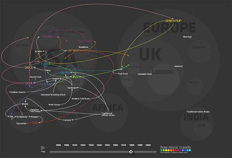 Click image to open the interactive version.
Tag Archives: Maps
A Map of a Woman’s Heart – Nineteenth-Century Ideas about Womanhood
This illuminating vintage illustration was created between 1833–1842 – reportedly by “A Lady” – and tells us much about what the artist and his society believed about women.
The map is titled “The Open Country of Woman’s Heart, Exhibiting its internal communications, and the facilities and dangers to Travellers therein” and is part of the exhibit “Beauty, Virtue and Vice: Images of Women in Nineteenth-Century American Prints“.
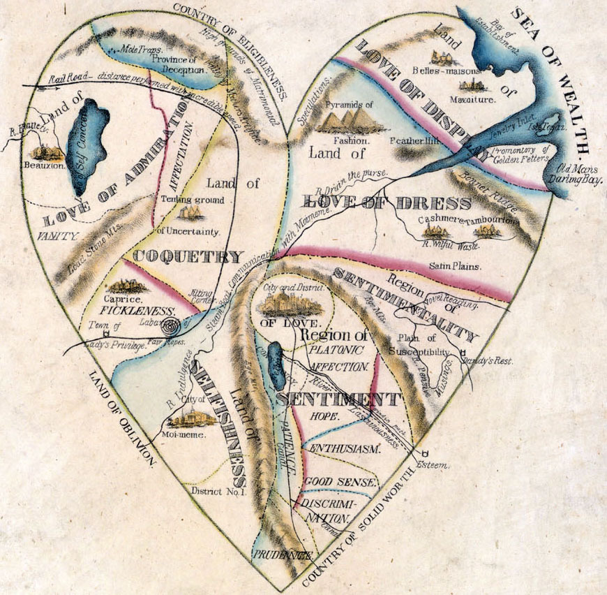
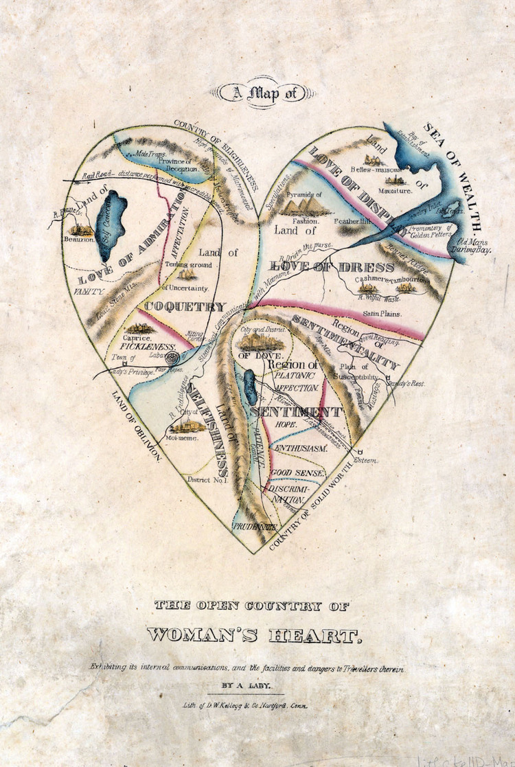
According to this map, Love is at the center of a woman’s heart, and Sentimentality and Sentiment (including Good Sense, Discrimination, Hope, Enthusiasm, and Platonic Affection) take up a sizeable portion of the entire territory. This region of Sentiment and Sentimentality is separated from the larger, treacherous areas of a woman’s heart: Selfishness and Coquetry pose dangers, especially to gentleman travelers, and these attributes suggest that all women are basically untrustworthy. The largest regions, Love of Admiration, Love of Dress, and Love of Display, all suggest that women are also essentially shallow and frivolous
You can get more background information about this illustration and age at the exhibit’s website.
Also check out this nice collection of similar illustrations that are “Mapping the Human Condition“.
Via Brain Pickings
Typographic Map for Your Living Room Wall
I love typographic maps! Here is another great example that you can actually order in form of wall stickers for your home or office.
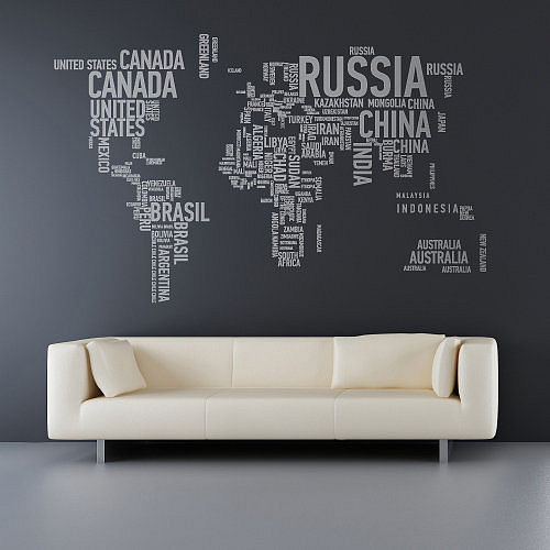
“A Different World’ by Sunny Side Up is available in 175cm x 108cm and your chosen color on notonthehighstreet.com (unfortunately delivered only within the UK).
Heat Maps of Flickr Photographs and Twitter Tweets
Eric Fischer created the heat map series „See something or say something” that shows where people post geotagged photos to Flickr and geotagged tweets to Twitter from.Red dots are locations of Flickr pictures, blue dots are locations of Twitter tweets, white dots are locations that have been posted to both.

Discover more heat maps of different cities from Jakarta to San Francisco on Flickr.
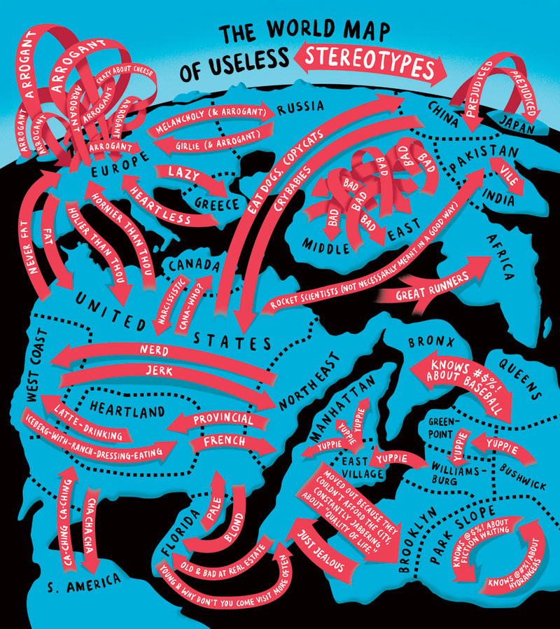
The World Map of Useless Stereotypes
Another brilliant illustration by Christoph Niemann for Abstract Sunday.
Geography meets Infographic: The True Size of Africa
Africa is really big, in fact big enough to fit the United States, China, India, Japan, and much of Europe within its borders. This is exactly what the illustrator Kai Krause shows us with his inventive map/infographic “The True Size of Africa”, which he describes as his contribution to “the fight against rampant Immappancy”, meaning insufficient geographical knowledge.
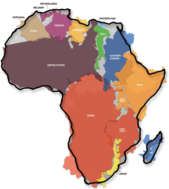

You can download the full size version of the map here.
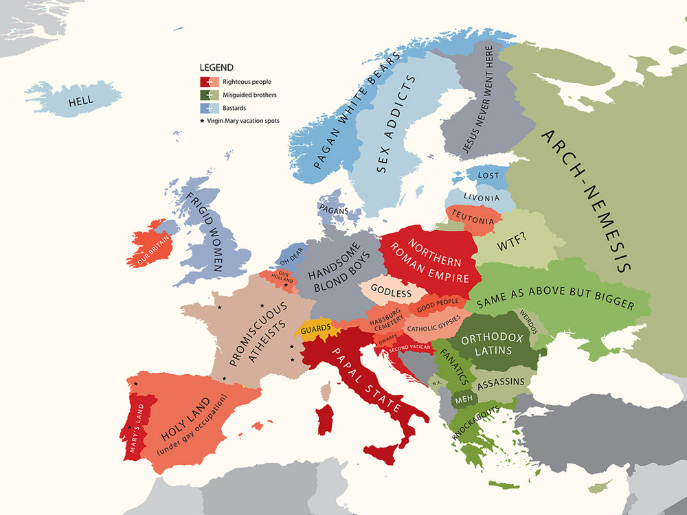
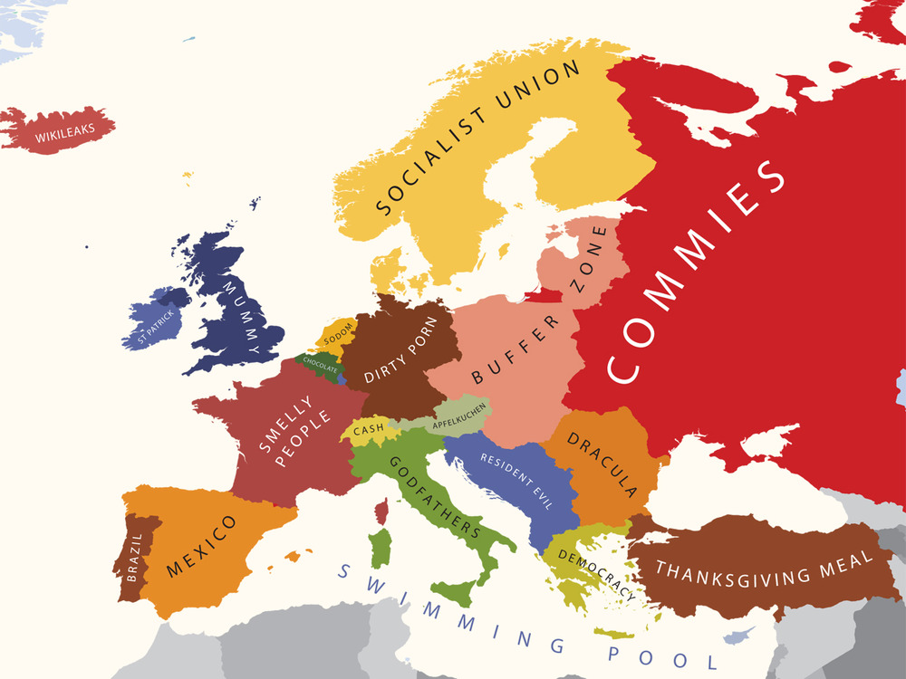
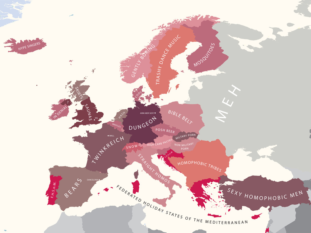
Geography meets Stereotypes: The Geography of Prejudice
Mapping Stereotypes: The Geography of Prejudice is a project by London-based graphic designer, illustrator and photographer Yanko Tsvetkov aka AlphaDesigner. As you should be aware of, a “sense of humor is highly recommended”.


In order of appearance:
– Europe According to The Vatican
– Europe According to USA
– Europe According to Russia
– Europe According to Germany
– Europe According to France
– Europe According to Gay Men
Be sure to view more cool stereotypes at Mapping Stereotypes and order the maps printed on posters, t-shirts, postcards, mousepads or binders at AlphaDesigner’s Zazzle-Shop.
By the way: It is an interesting fact, that the map „Europe According to the Vatican” was co-developed with the devil. Read the full story: Europe. In Nomine Patris, et Filii, et Stereotypus Sancti.
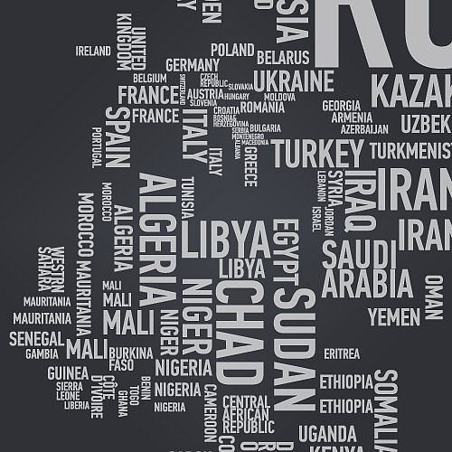
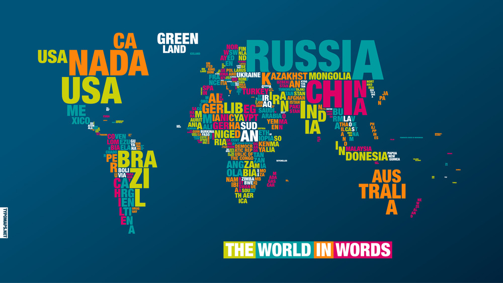
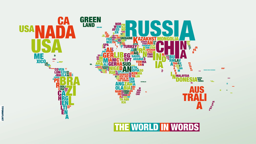
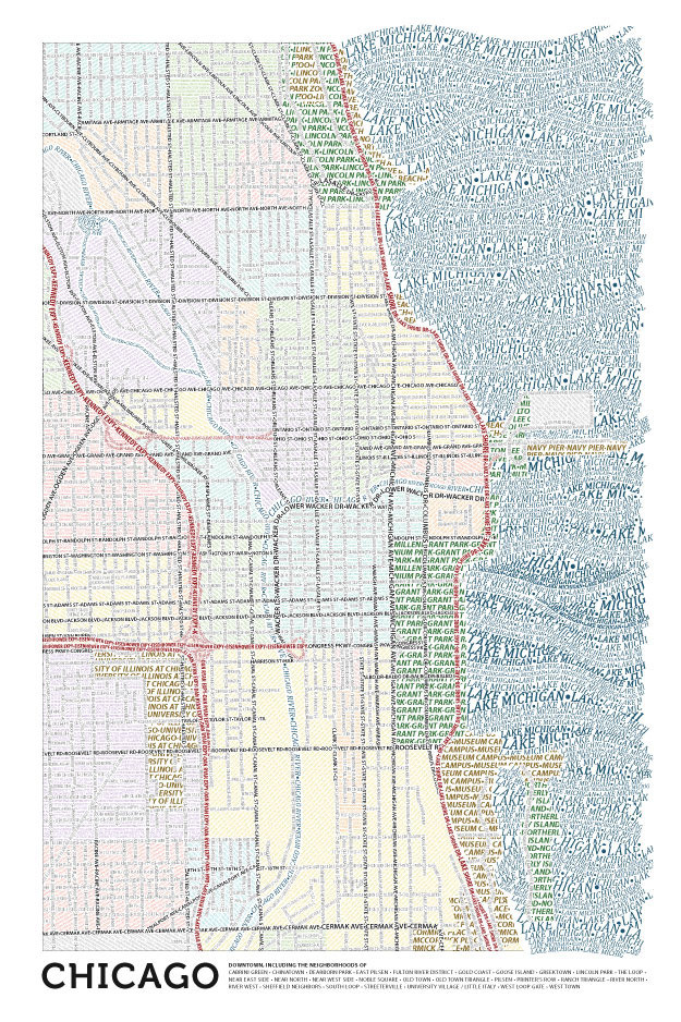
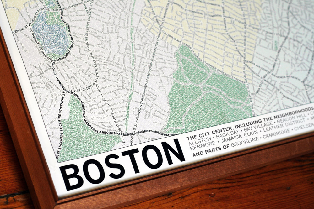
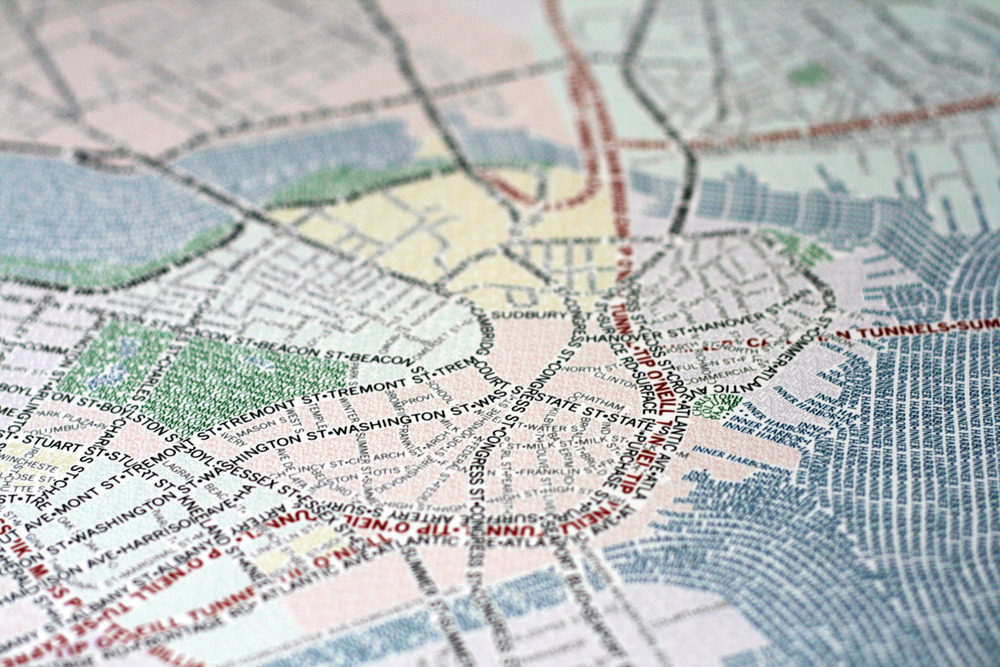
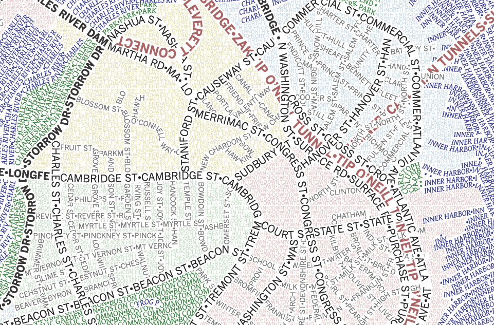
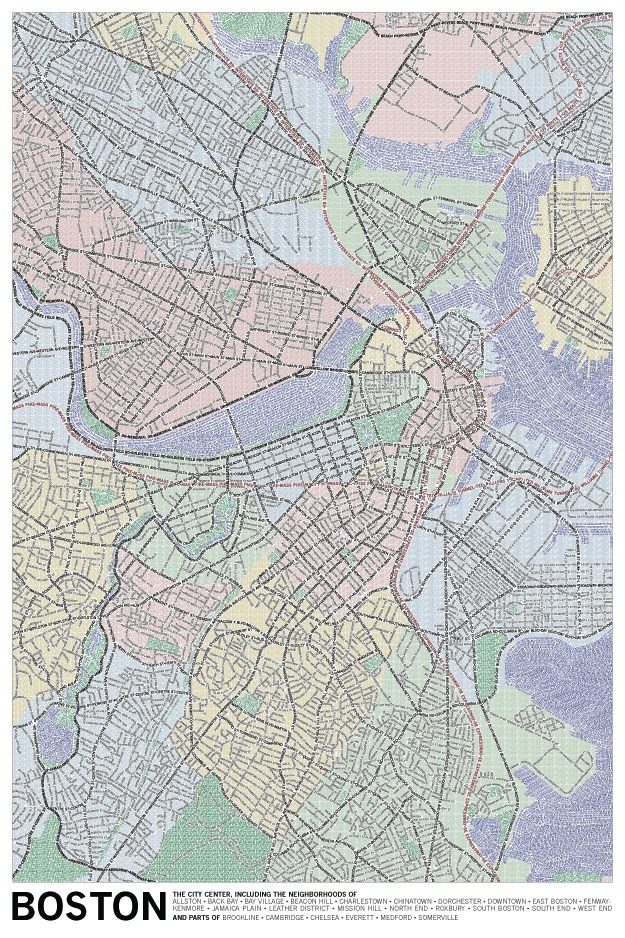
Geography meets Typography: Typographic Maps
Typomaps is an experiment gone product by German designer Dirk Schächter. You can order the world map made of letters (Helvetica Neue Black Condensed to be exact) in 100 cm x 70 cm or download both versions in different resolutions for iPad, iPhone or computer screen.
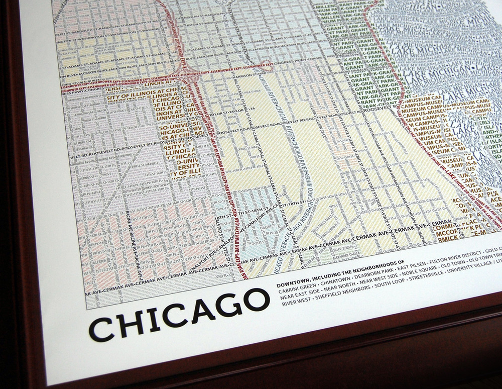
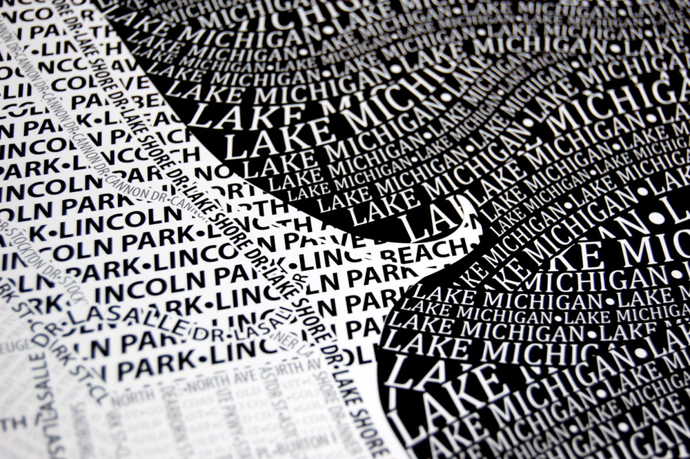
Typographic Maps is a similar project by Andy Woodruff, Mark Harrower and Ben Sheesley of Axis Maps (Texas, USA). The maps of Chicago and Boston, which took nearly two years to finish, depict the streets and highways, parks, neighborhoods, coastlines, and physical features of the cities using nothing but type. From a distance they can appear as accurate reference maps, and as you get closer you notice the thousands of words they comprise. You can order the maps in different sizes at Zazzle.

How big is the Deepwater Horizon oil spill
Paul Rademacher’s GoogleMaps layer allows you to overlay the oil spill on any city. Go to paulrademacher.com/oilspill to get an idea of just how large it is.
Some impressive photography about the desaster can be found at www.boston.com/bigpicture/2010/05/disaster_unfolds_slowly_in_the.html