Visualizing how our population reached 7 Billion so fast

It was just over two centuries ago that the global population was 1 billion in 1804. But better medicine and improved agriculture resulted in higher life expectancy for children, dramatically increasing the world population.

Watch how our global population exploded from 300 million to 7 billion in this brilliantly visualized video by Adam Cole and Maggie Starbard for NPR.

For more detailed information on the topic, read the related article on NPR

Moreover, I highly recommend you to watch Hans Rosling’s eye-opening and entertaining talk on global population growth (infact, this is a must-see). 

Infographic vs. Video

During this year’s See Conference there was an interesting discussion whether facts and figures are better transported via infographic or video. While there obviously is no clear answer to that – the “best” format being dependent on content, audience, situation etc. it is worthwhile to compare the different effects of each format.

Here are two examples in which the same information is presented as infographic and in a video. Choose for yourself:

Obsessed With Facebook
OnlineSchools.org presented this infographic, Alex Trimpe the according motion graphics video:

Obsessed-with-facebook_1e


The Billion Dollar Gram / Debtris US

In the second example, both infographic and animation were created by data journalist and information designer David McCandless (Information is Beauftiful):

Billion_dollar_960


Which format do you prefer and why?

Hand-Printing Computer-Generated Art by Marius Watz and Jer Thorp

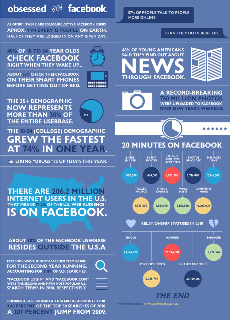
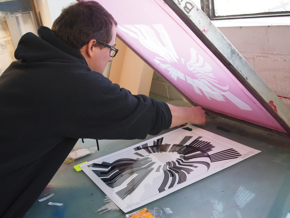
Generative Art, created by computer software and mathematical equations, and the traditional craft of printing (by hand) usually don’t come together very often. What happens, when you put a MacBook Pro and big buckets of color next to one another, is shown by artists Marius Watz and Jer Thorp for the Random Number Multiples series, an ongoing art publishing extension of Christina Vassallo’s curatorial platform Random Numbers.

Random Number Multiples provides an opportunity for artists to expand their repertoire through artwork editioning processes. It is a platform for artists to experiment with new techniques or engage with familiar ones in new ways.

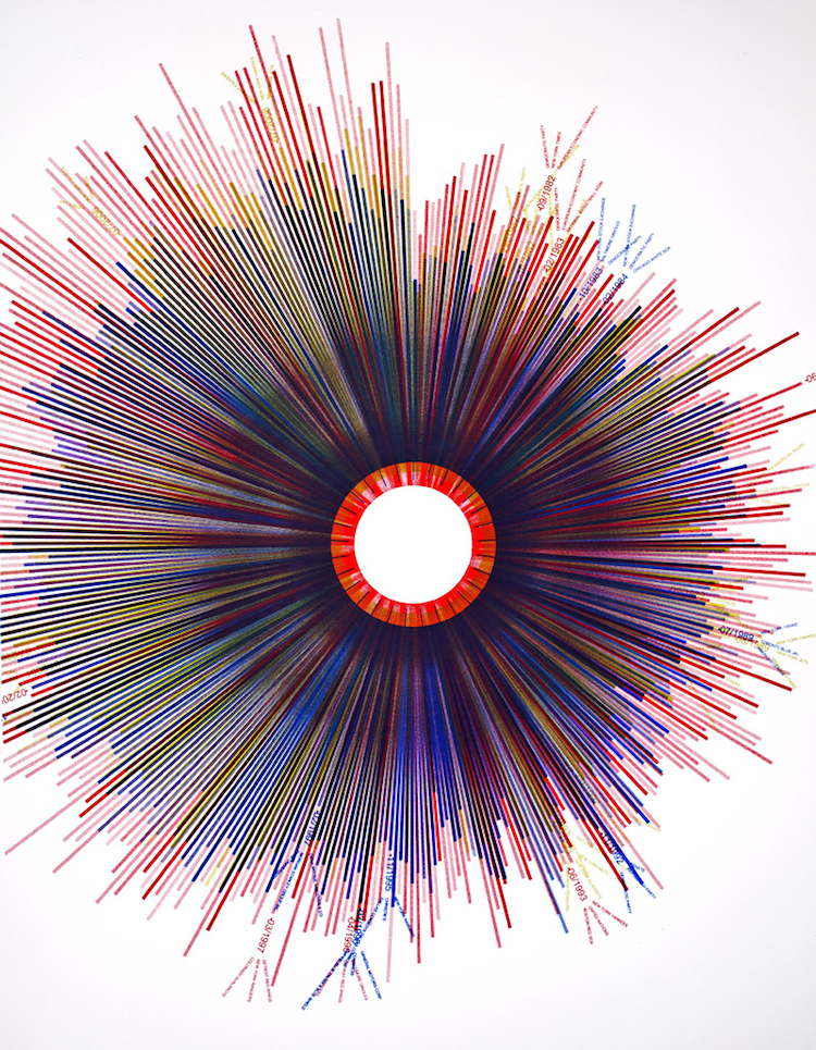
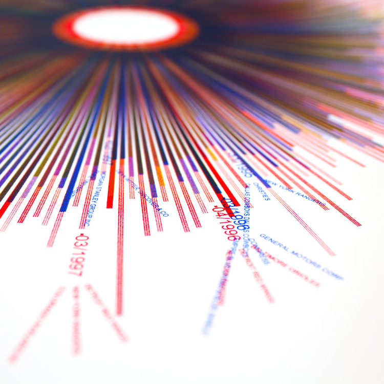
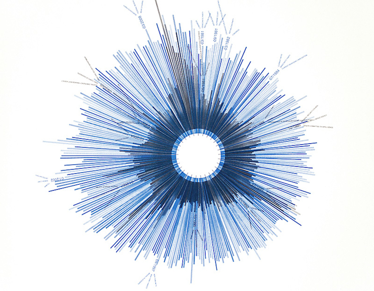
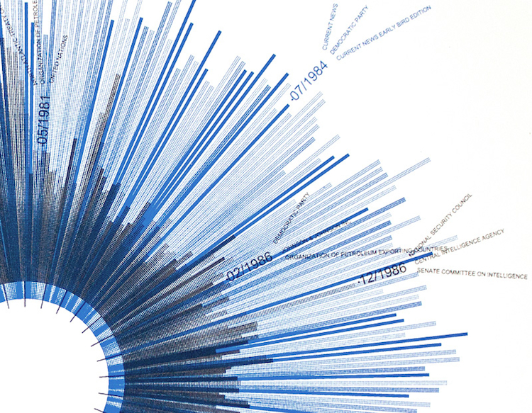
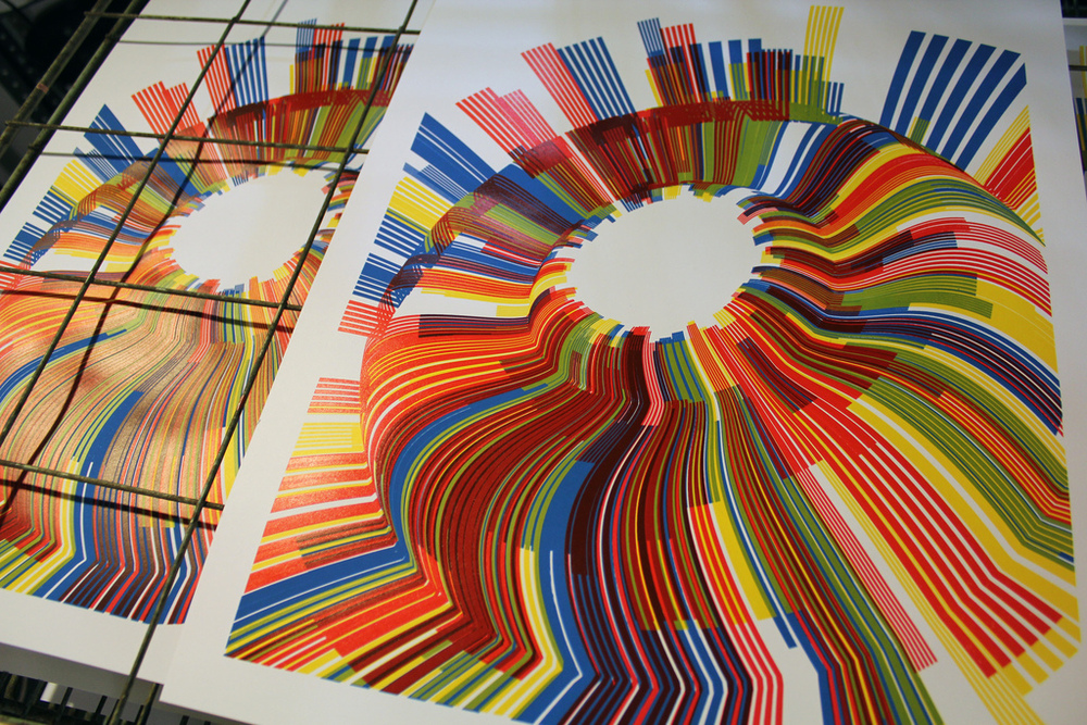
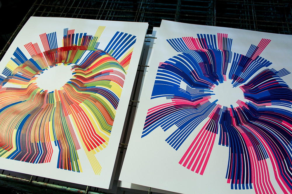
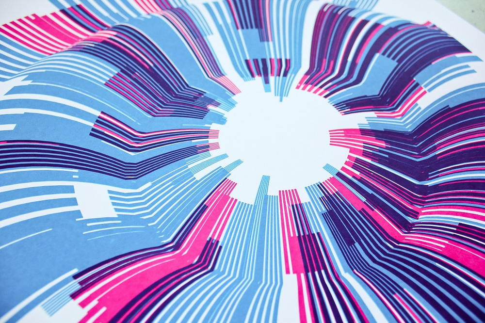
As the current Data Artist-in-Residence at the New York Times, Jer Thorp took the newspaper as his reference point. With two separate works, or “timepiece graphs,” he tracked how often the Times printed the words ”red,” “green,” and “yellow” resp. “hope” and “crisis” from 1981 to 2010. Each piece is arranged so that the data can be read clockwise.
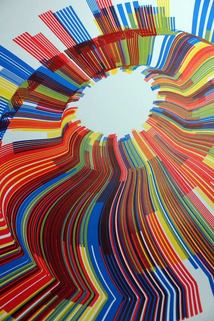
Randomnumbermultiplesjerthorpa
Randomnumbermultiplesjerthorp3
5363697277_0c39404cf0_b
Randomnumbermultiplesjerthorp1
Randomnumbermultiplesjerthorp2
5362872334_1969794255_b
5394021443_6c02c258d3_b
5362882962_69f74ffac3_b
5386696682_5366d9f0e8_b
5378932504_ca75d7f9e3_b
5362868544_4c2bbcb72d_b
5363709885_82e3d9f27e_b
5391949346_425146b7ce_b

Turning the New York Subway System into an Interactive String Instrument

The data visualization “Conductor” by Alexander Chen turns the New York subway system into an interactive string instrument. Using the MTA’s actual subway schedule, the piece begins in realtime by spawning trains which departed in the last minute, then continues accelerating through a 24 hour loop. Each time a train crossed the line of another train, you hear a cello pizzicato sound pitched according to the length of the line. You can find the interactive version (where you can also pluck the strings at will) at www.mta.me or watch the video below.

Special Tip: Open www.mta.me in 2 or 3 tabs simultaneously to get a great sound experience.


If you are interested in the technical implementation of “Conductor”, read the project description at Chen’s Blog.

Visualizing Friendships on Facebook

Paul Butler, currently intern on Facebook’s data infrastructure engineering team, analyzed the relationships of cities around the world through the eyes of Facebook.

Visualizing data is like photography. Instead of starting with a blank canvas, you manipulate the lens used to present the data from a certain angle.

163413_479288597199_9445547199

Read the whole story behind the creation of the inforgraphic at the Facebook Engineering Blog.

Hans Rosling on Global Population Growth

Speaking of Hans Rosling, the master of presenting macro economical data in an entertaining and truly mindset-changing way recently talked about the world population growth at TED in Cannes. In this talk, he does not only present his data digitally using his cool Gapminder software, but also mixes in some analog visualization technique as well. This new “analog teaching technology” he picked up from Ikea, he says.

Be sure to also take a look at his past presentations at TED which are definitely worth watching:
Hans Rosling: Asia’s rise — how and when (2009)
Hans Rosling: Let my dataset change your mindset (2009)
Hans Rosling on HIV: New facts and stunning data visuals (2009)
Hans Rosling’s new insights on poverty (2007)
Hans Rosling shows the best stats you’ve ever seen (2006)

David McCandless on the Beauty of Data Visualization

In this TED talk by David McCandless, he shows and explains examples, that turn complex data sets (like worldwide military spending, media buzz, Facebook status updates) into beautiful, simple diagrams that tease out unseen patterns and connections. Good Data Visualization, he suggests, is the best ways to compress knowledge and it may just change the way we see the world. Quoting Hans Rosling, “Let my dataset change your mindset”.

For more examples of data visualization visit David’s website or buy his book “Information is Beautiful” at Amazon.com/Amazon.de.