During this year’s See Conference there was an interesting discussion whether facts and figures are better transported via infographic or video. While there obviously is no clear answer to that – the “best” format being dependent on content, audience, situation etc. – it is worthwhile to compare the different effects of each format.
Here are two examples in which the same information is presented as infographic and in a video. Choose for yourself:
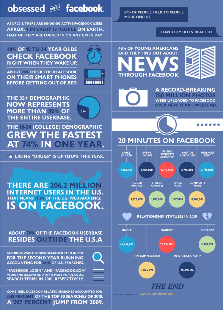
Obsessed With Facebook
OnlineSchools.org presented this infographic, Alex Trimpe the according motion graphics video:
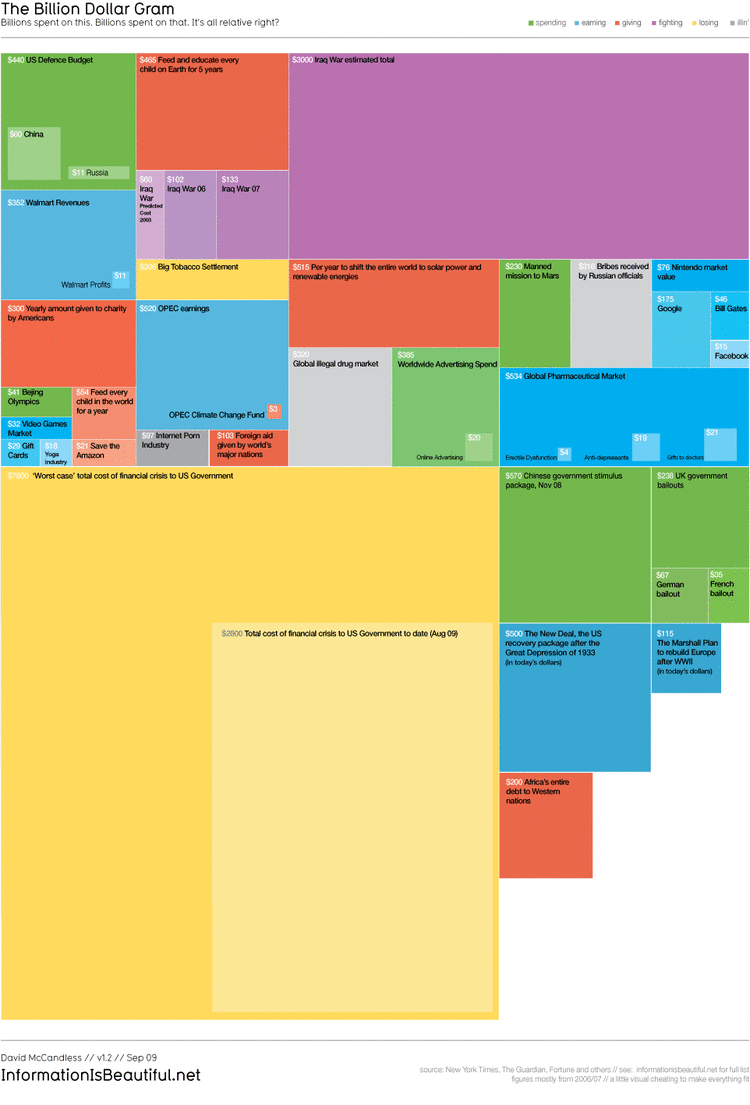
The Billion Dollar Gram / Debtris US
In the second example, both infographic and animation were created by data journalist and information designer David McCandless (Information is Beauftiful):
Which format do you prefer and why?

