Thomson Holidays published this great interactive map that shows the evolution of western dance music over the last 100 years. The map shows the time and place where each of the music styles were born and which blend of genres influenced the next.
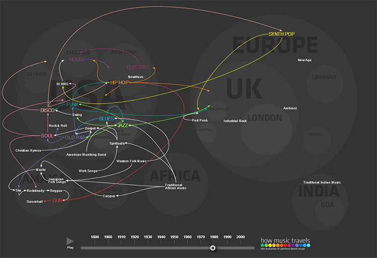 Click image to open the interactive version.
Tag Archives: Infographics
Visualizing how our population reached 7 Billion so fast
It was just over two centuries ago that the global population was 1 billion in 1804. But better medicine and improved agriculture resulted in higher life expectancy for children, dramatically increasing the world population.
Watch how our global population exploded from 300 million to 7 billion in this brilliantly visualized video by Adam Cole and Maggie Starbard for NPR.
For more detailed information on the topic, read the related article on NPR.
Moreover, I highly recommend you to watch Hans Rosling’s eye-opening and entertaining talk on global population growth (infact, this is a must-see).
A Map of a Woman’s Heart – Nineteenth-Century Ideas about Womanhood
This illuminating vintage illustration was created between 1833–1842 – reportedly by “A Lady” – and tells us much about what the artist and his society believed about women.
The map is titled “The Open Country of Woman’s Heart, Exhibiting its internal communications, and the facilities and dangers to Travellers therein” and is part of the exhibit “Beauty, Virtue and Vice: Images of Women in Nineteenth-Century American Prints“.
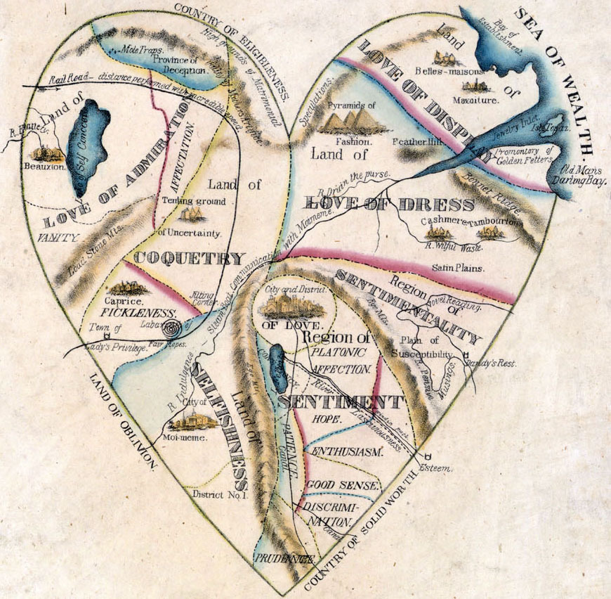
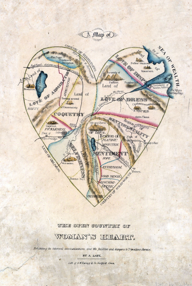
According to this map, Love is at the center of a woman’s heart, and Sentimentality and Sentiment (including Good Sense, Discrimination, Hope, Enthusiasm, and Platonic Affection) take up a sizeable portion of the entire territory. This region of Sentiment and Sentimentality is separated from the larger, treacherous areas of a woman’s heart: Selfishness and Coquetry pose dangers, especially to gentleman travelers, and these attributes suggest that all women are basically untrustworthy. The largest regions, Love of Admiration, Love of Dress, and Love of Display, all suggest that women are also essentially shallow and frivolous
You can get more background information about this illustration and age at the exhibit’s website.
Also check out this nice collection of similar illustrations that are “Mapping the Human Condition“.
Via Brain Pickings
Heat Maps of Flickr Photographs and Twitter Tweets
Eric Fischer created the heat map series „See something or say something” that shows where people post geotagged photos to Flickr and geotagged tweets to Twitter from.Red dots are locations of Flickr pictures, blue dots are locations of Twitter tweets, white dots are locations that have been posted to both.

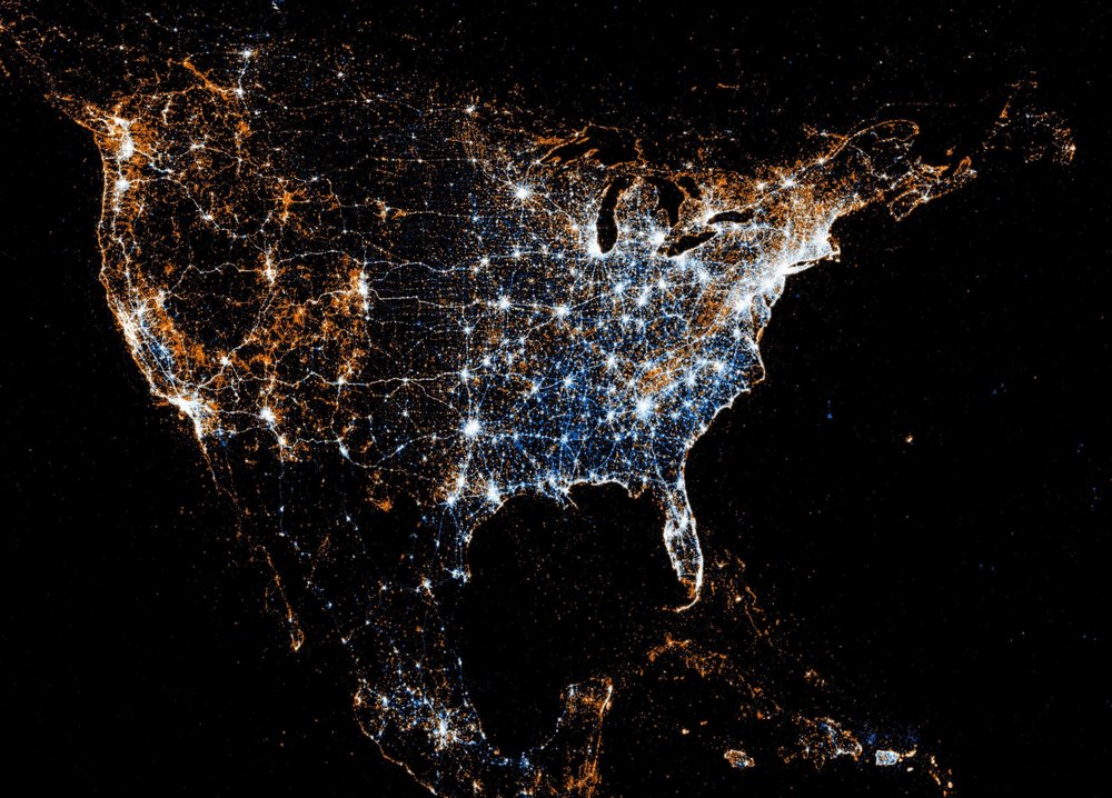
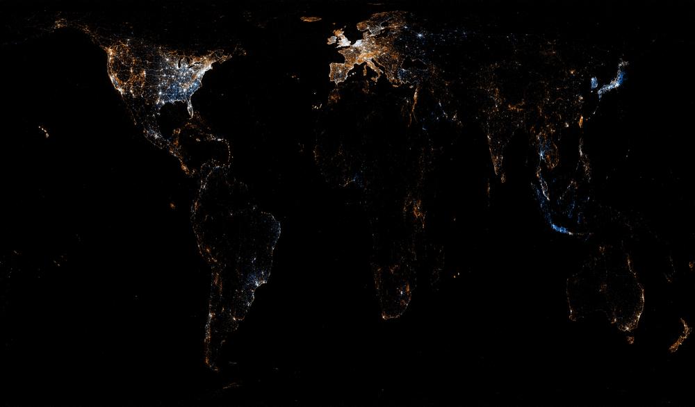
Discover more heat maps of different cities from Jakarta to San Francisco on Flickr.
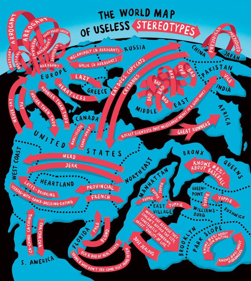
The World Map of Useless Stereotypes
Another brilliant illustration by Christoph Niemann for Abstract Sunday.
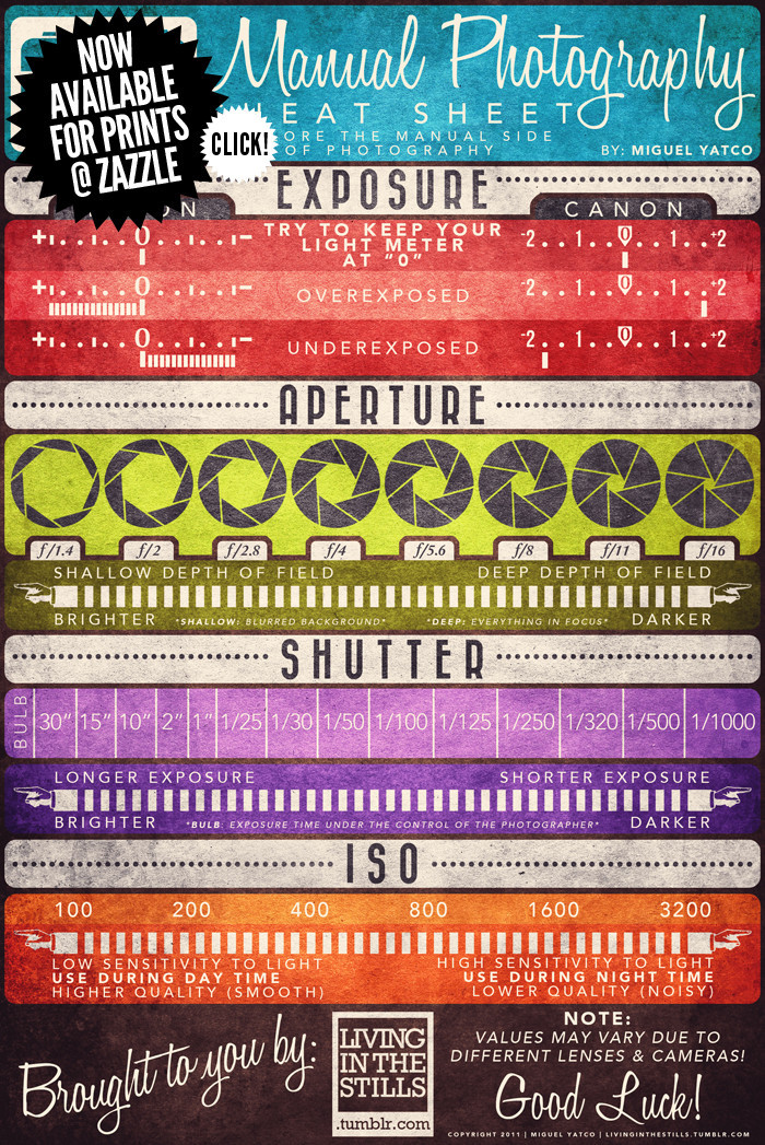
Manual Photography Cheat Sheet
No more excuses not to use the manual mode of your cameras! Great infographic by Miguel Yatco from Manila, Philippines.
Infographic vs. Video
During this year’s See Conference there was an interesting discussion whether facts and figures are better transported via infographic or video. While there obviously is no clear answer to that – the “best” format being dependent on content, audience, situation etc. – it is worthwhile to compare the different effects of each format.
Here are two examples in which the same information is presented as infographic and in a video. Choose for yourself:
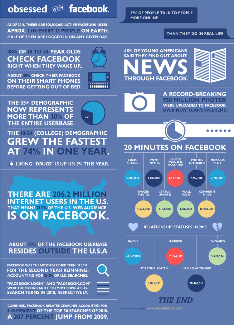
Obsessed With Facebook
OnlineSchools.org presented this infographic, Alex Trimpe the according motion graphics video:
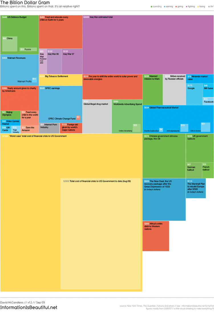
The Billion Dollar Gram / Debtris US
In the second example, both infographic and animation were created by data journalist and information designer David McCandless (Information is Beauftiful):
Which format do you prefer and why?
Visualizing Friendships on Facebook
Paul Butler, currently intern on Facebook’s data infrastructure engineering team, analyzed the relationships of cities around the world through the eyes of Facebook.
Visualizing data is like photography. Instead of starting with a blank canvas, you manipulate the lens used to present the data from a certain angle.
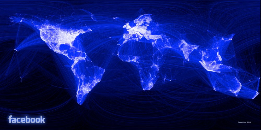
Read the whole story behind the creation of the inforgraphic at the Facebook Engineering Blog.
Victorian Infographics
Peacay collected this fantastic series of Victorian Infographics from the time between 1830 to 1890.
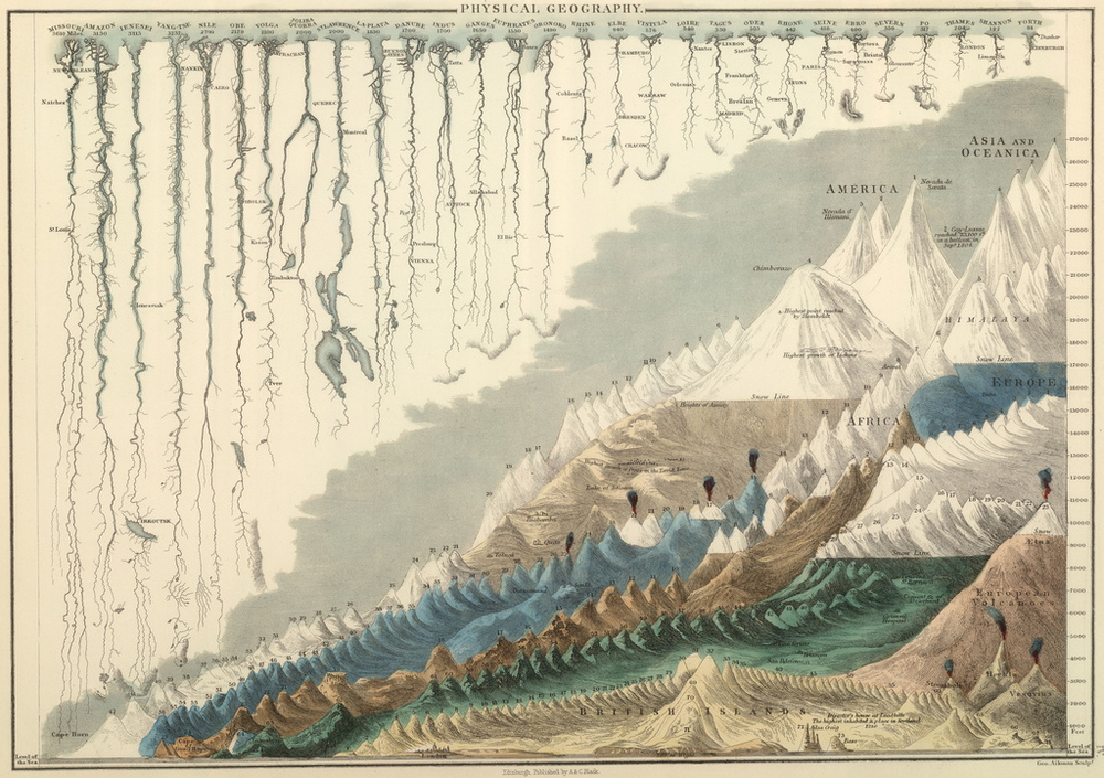
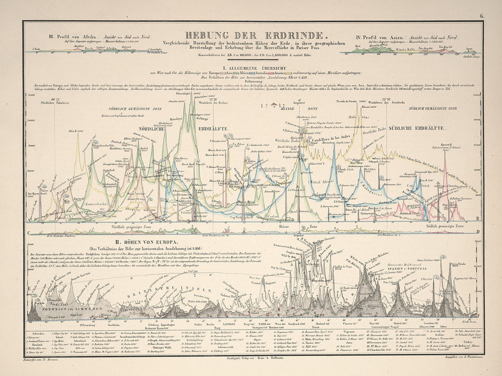
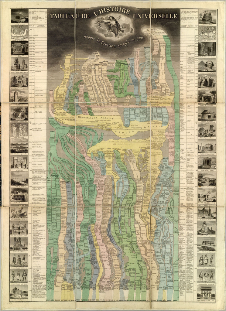
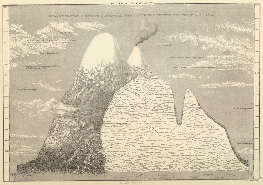
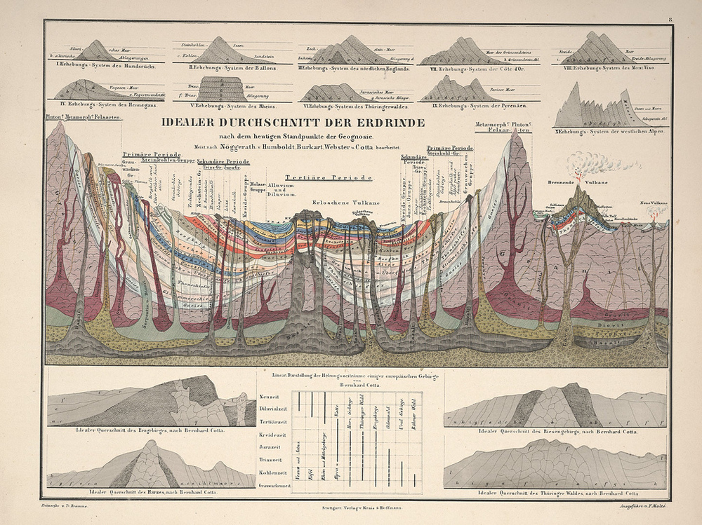
Visit BibliOdyssey to see the complete collection including the sources and links to the high resolution originals on flickr.