Interesting!
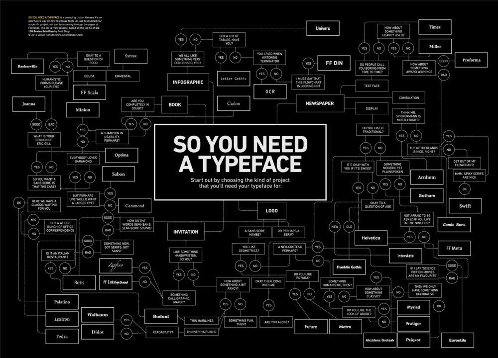
If you’re struggling to find the right typeface for your next design project, try this fun-to-use infographic by graphic designer Julian Hansen from Copenhagen.
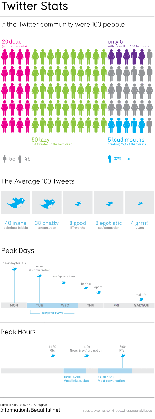
In this TED talk by David McCandless, he shows and explains examples, that turn complex data sets (like worldwide military spending, media buzz, Facebook status updates) into beautiful, simple diagrams that tease out unseen patterns and connections. Good Data Visualization, he suggests, is the best ways to compress knowledge and it may just change the way we see the world. Quoting Hans Rosling, “Let my dataset change your mindset”.
For more examples of data visualization visit David’s website or buy his book “Information is Beautiful” at Amazon.com/Amazon.de.
Ever felt overwhelmed by the sheer number of different coffee specialties on any bar’s menu? This guide by Plaid Creative will help you pass as a real coffee connoisseur next time.
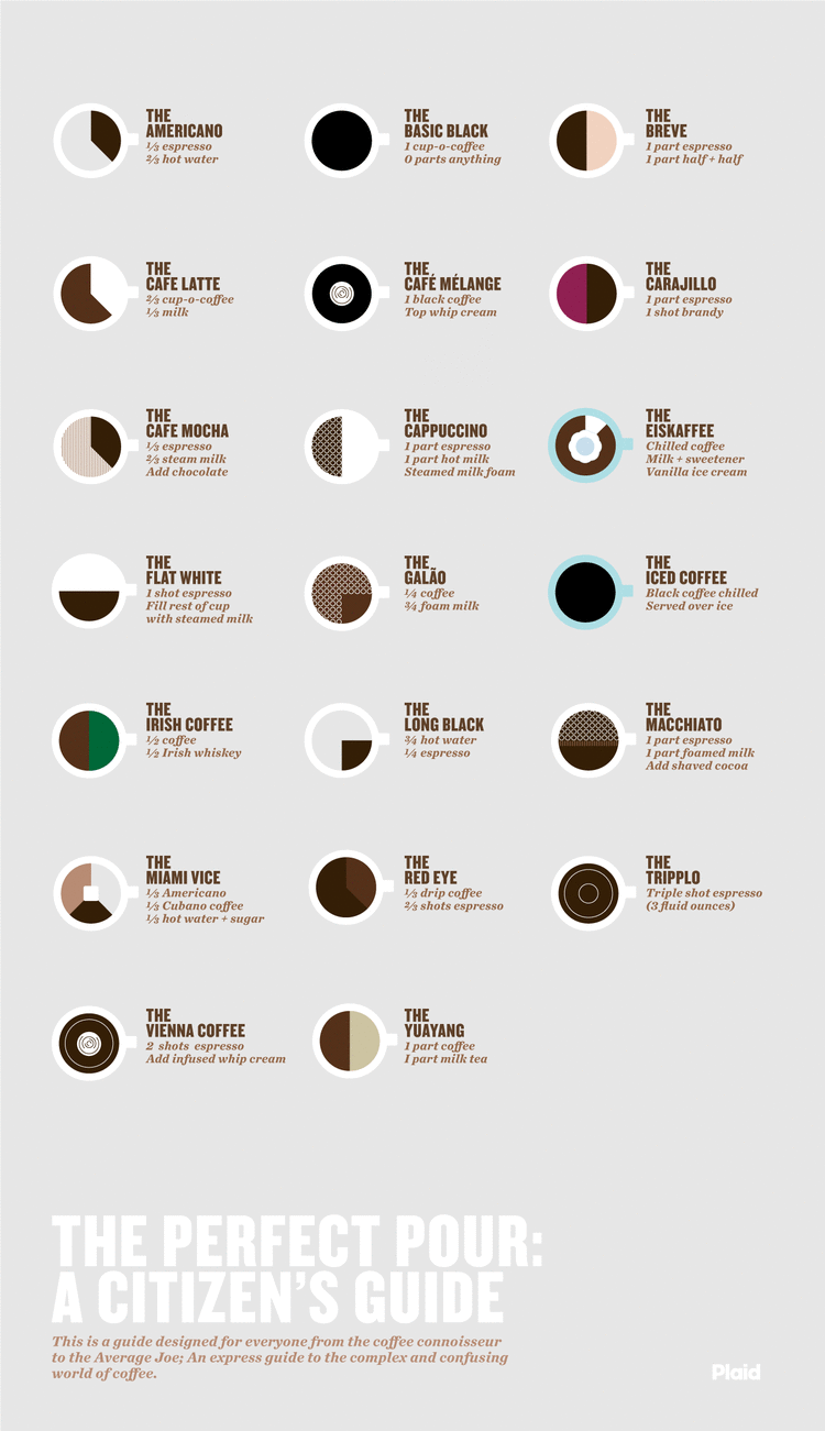
Via The Modern Gentleman.
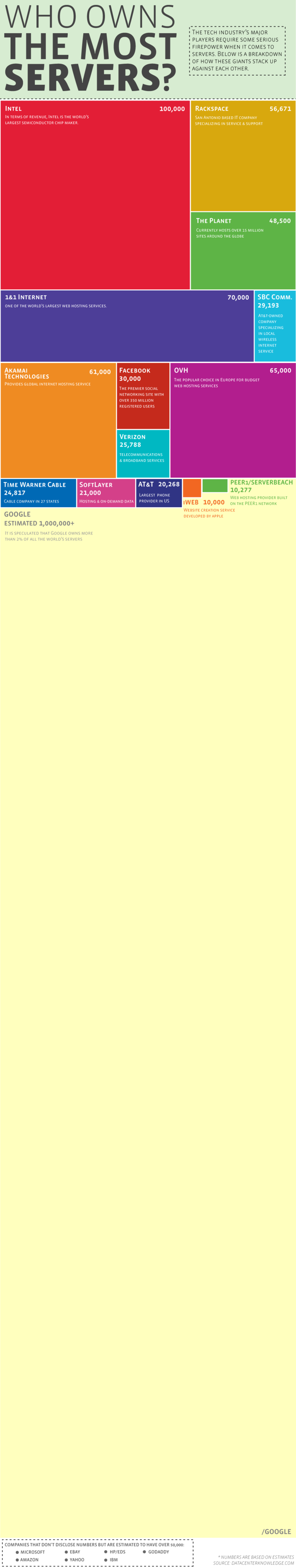
Check out this brilliant collection of outstanding social media infographics.
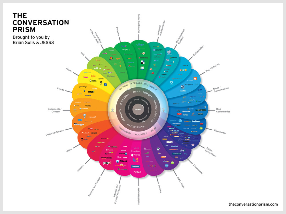
See the full list at Now Sourcing.
Paul Rademacher’s GoogleMaps layer allows you to overlay the oil spill on any city. Go to paulrademacher.com/oilspill to get an idea of just how large it is.
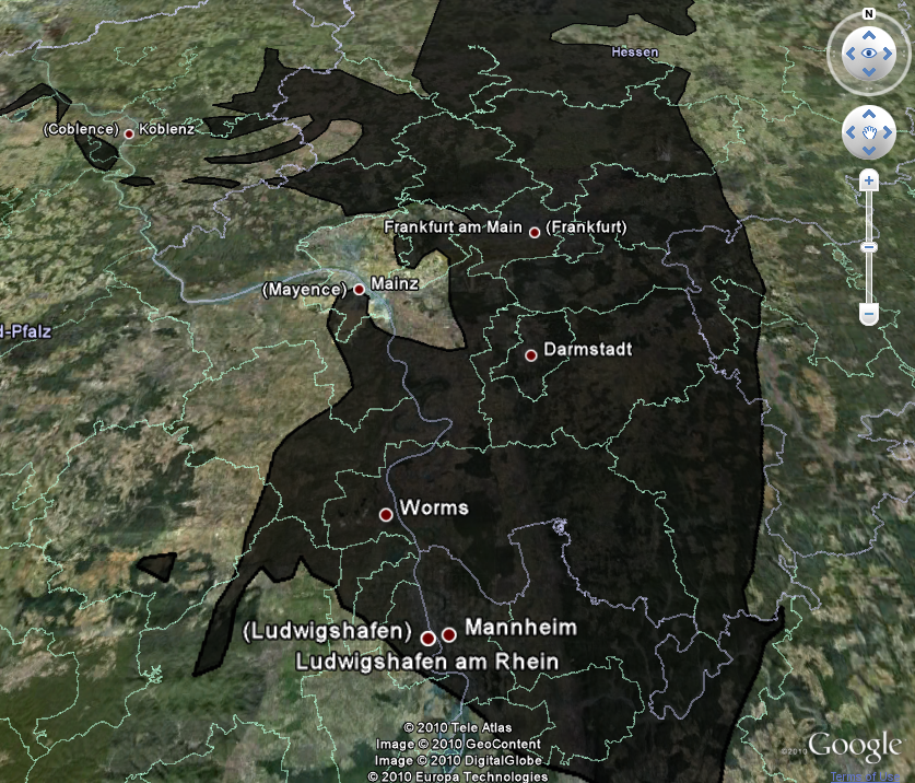
Some impressive photography about the desaster can be found at www.boston.com/bigpicture/2010/05/disaster_unfolds_slowly_in_the.html